What This Covers
How we rebuilt Omnilyst's brand identity in five days, what changed when we moved from corporate dark navy to human-centered design, and the immediate measurable impact on audience perception and business metrics.
Key results:
Website visits increased from 500 per week to over 2000 per week
Conversion rates improved by 35 percent
Inbound interest shifted from silence to three daily messages
Brand perception changed before we added new features
THE YEAR OF STAGNATION
What We Got Wrong About Professional
For over a year, Omnilyst ran on what we thought was professional branding. Dark navy blue backgrounds. Gray interfaces. Corporate language that sounded like every other SaaS platform promising to revolutionize your workflow.
The design followed best practices. The copy was optimized. Everything looked polished. But nothing stuck. We were getting 500 website visits per week. Conversion rates sat stubbornly low. Most importantly, nobody was reaching out asking for access.
Sit with any brand team long enough and you'll spot the pattern. The endless quest to look professional slowly squeezes all personality out. Posts become interchangeable. Headlines sound like copy-paste.
I remember asking our team, does this sound like us? Long pause. Then honesty: not really. We don't recognize ourselves in our own content anymore.
THE BRAND VOICE PROBLEM
When Professional Meant Forgettable
Most brand content nowadays sounds the same. It's optimized. Polished. Maybe even AI-generated. But ultimately forgettable.
The strangest part? The businesses creating it often don't realize it. Instead, they're calling it professional. They're trying to post consistently. But nothing sticks.
When we sat down with teams struggling with the same problem, we heard consistent feedback. We know what we stand for, we just don't see that reflected in what we post. AI helped us move faster, but somewhere along the way we lost our actual voice.
This wasn't a marketing problem. It was a brand voice problem. And underneath it, a systems problem. If you don't know how to define your voice, AI won't fix that. It'll just scale the confusion.

THE FIVE DAY DECISION
What We Changed and Why
In May, we made a drastic decision. We shut everything down for five days and rebuilt the brand from foundation up. Not a logo tweak. A complete identity overhaul focused on one question: if our face isn't in the post, do people still know it's us?
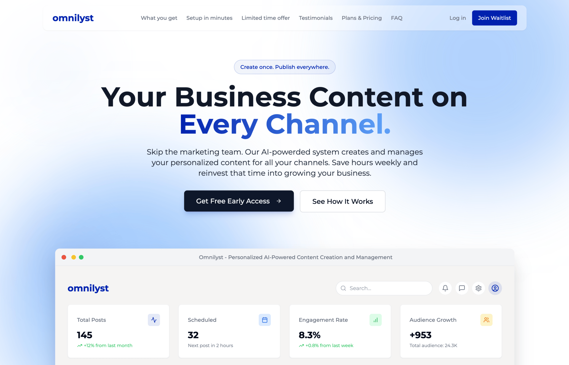
The old branding used dark navy blue backgrounds with gray interfaces. It looked like every corporate SaaS dashboard. Serious. Technical. Emotionless. We thought this signaled professionalism and credibility. What it actually signaled was interchangeability.
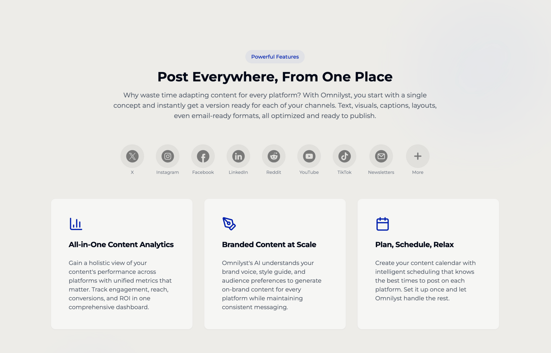
The new branding moved to bright, clean design with white backgrounds and vibrant blue accents. We stripped out the corporate darkness that made everything feel heavy and inaccessible.
But the visual change was secondary. The real transformation happened in brand voice definition. We stopped trying to sound like a professional platform and started sounding like people who understand the exact frustration our users face.
The headline changed from welcome to Omnilyst, your all-in-one content creation and management solution to something more honest: what if you could take back ten hours of your week and still show up across every channel?
The copy throughout stopped listing features and started acknowledging reality. It started as a tab. Just one. Then two. Then seven open tabs. Then five tools. Then wait, did we post that on LinkedIn or just Instagram?
This wasn't marketing copy. This was naming the specific chaos our users experienced every day.
THE SCIENCE BEHIND THE SHIFT
Why Visual Identity Affects Perceived Credibility
Research on brand perception reveals why our old design failed despite being technically correct. Dark, muted color schemes increase perceived complexity while decreasing approachability. Navy blue and gray combinations signal traditional corporate authority but reduce emotional connection.
Visual weight affects cognitive load. Dark backgrounds with light text require more processing effort than light backgrounds with dark text. Our old design made every interaction feel heavier than necessary.
Brand recognition research shows that distinctive visual systems increase recall by 80 percent compared to generic designs following category conventions. By looking like every other SaaS platform, we were actively working against memorability.
Whitespace usage affects perceived value. The new design increased whitespace significantly, allowing each element to breathe. This paradoxically made the platform feel more premium despite using brighter, friendlier colors.

THE IMMEDIATE IMPACT
What Changed in the First Week
The rebrand launched in May . The results showed up immediately, before we added any new features or changed functionality.
Website visits jumped from 500 per week to over 2000 per week within the first seven days. Same content promotion, different brand presentation. Conversion rates increased 35 percent. The same traffic converted better simply because the brand communicated clarity and identity rather than generic professionalism.
Most telling was the qualitative shift. I started receiving at least three direct messages per day from people asking for immediate platform access. This continues consistently. The old branding generated maybe one inquiry per week.
The messages revealed what changed in perception. People weren't asking about features or pricing. They were saying this finally looks like something built for real people, not another corporate tool.
LinkedIn post engagement doubled despite no change in content strategy. The visual system made posts instantly recognizable in feeds. When your face isn't in the post, people still knew it was us.
THE SYSTEMS LESSON
What This Reveals About Brand Clarity
The rebrand proved something we suspected but hadn't validated. Consistency isn't showing up. Consistency is showing up as yourself.
Most brands don't lack creativity. What they lack is identity. You can crank out weekly updates at lightning speed, but if there's no heartbeat, your audience scrolls right past.
Before you talk consistency, talk clarity. What do you stand for? Who are you, really? If your content doesn't reflect it, strip back the best practices and build guardrails that keep your identity at the center.
We're not lacking content. We're drowning in it. What we're really lacking is alignment. A thread that ties your beliefs to your words. Your values to your visibility.
Our old brand failed not because the design was bad but because it wasn't aligned with our actual identity. We tried to look like what we thought a credible platform should look like. The new brand succeeds because it looks like who we actually are.

THE TACTICAL FRAMEWORK
How to Apply This to Your Brand
Define voice before you optimize output. Most businesses jump straight to content creation without establishing the voice that makes content recognizable.
Test for identity recognition. Show your content to someone unfamiliar with your brand. Remove your logo. Ask if they can identify which pieces belong together. If they can't, your voice isn't distinct enough.
Examine visual weight. Does your design make interaction feel heavy or light? Dark interfaces signal seriousness but reduce approachability.
Audit for generic language. Search your materials for phrases like innovative solution, cutting-edge technology, industry-leading platform. These mean nothing. Replace them with specific descriptions of actual problems you solve.
Prioritize recognition over perfection. A distinctive brand that feels slightly rough outperforms a polished brand that looks like everyone else.
Measure perception, not just traffic. Track qualitative signals including message tone and question types alongside quantitative metrics.
THE ONGOING RESULT
What Changed Beyond Numbers
The rebrand didn't just improve metrics. It changed how we show up. Creating content feels different when brand identity is clear. There's less second-guessing because the guidelines are rooted in actual identity rather than borrowed best practices.
Most importantly, we stopped blending in. The business results matter, but the psychological shift matters more. We know who we are. Our audience knows who we are.
Your brand isn't what you say about yourself. It's what people recognize about you before you say anything. When visual identity and voice align with actual values, that recognition happens immediately.
SEE THE REBRAND IN ACTION
Experience The New Omnilyst Brand

See how we implemented brand voice, visual identity, and authentic messaging across the entire platform. From homepage to product interface, explore the design decisions that increased conversion rates by 35 percent and transformed audience perception in one week.
A FINAL NOTE
Distinctive beats perfect every time.
The distance between invisible and memorable is measured not in polish but in clarity about who you are and courage to show it consistently.
Until next time,

